
JD Sports - Main Navigation
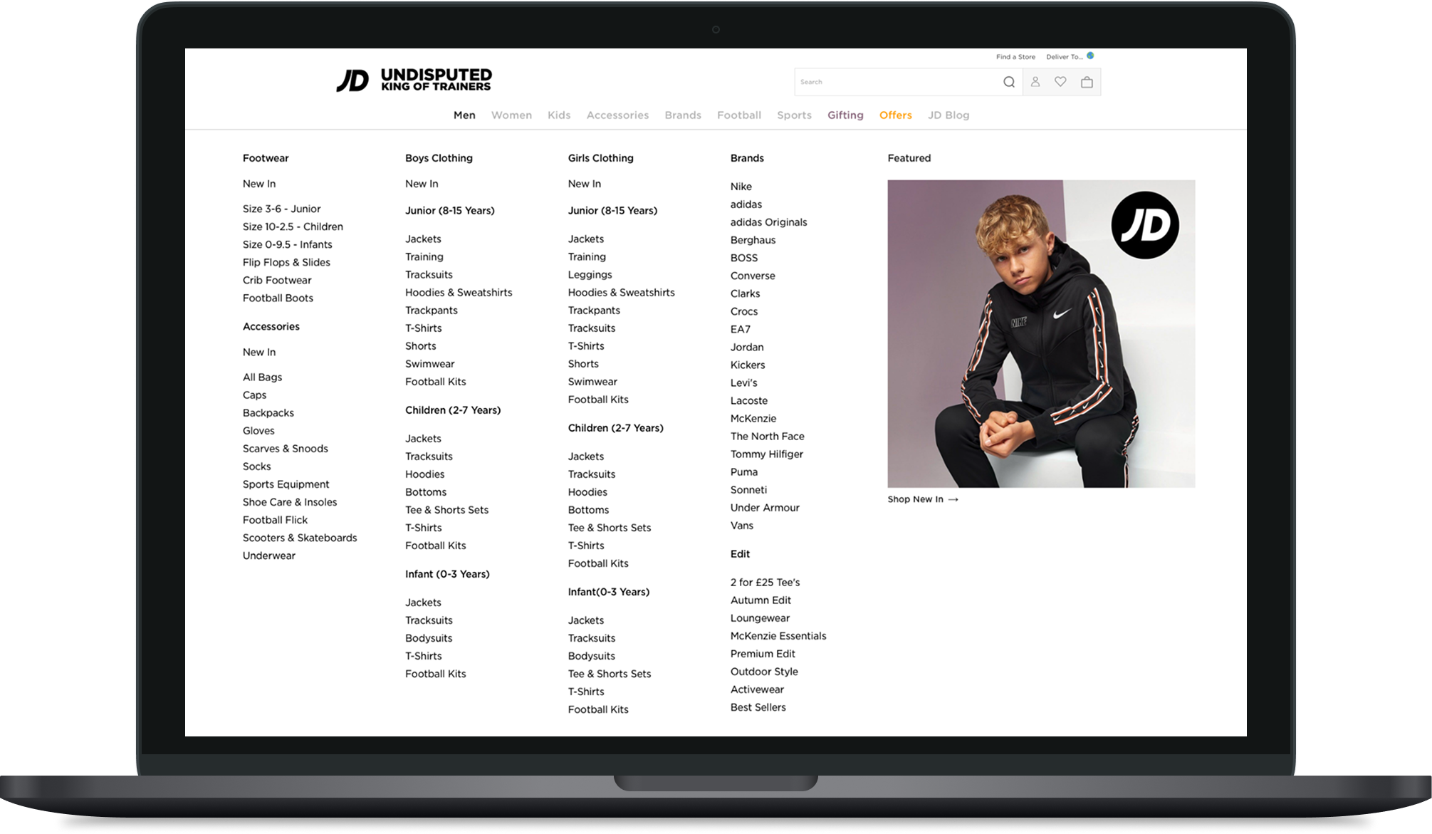
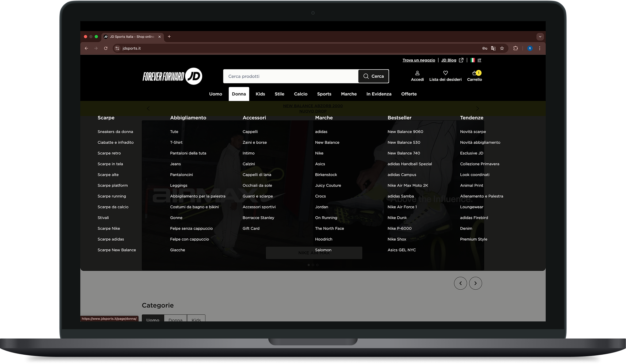
- Navigation CTR
- Increased from 18% to 32%
- A/B test revenue
- £300k+ over a 28-day test period
- Monthly sessions
- Over 10 million
- Trading peaks held
- 2 major peaks post-launch, no degradation
Context
JD Sports' UK navigation handles over 10 million sessions per month. It is the primary routing layer across a trading calendar built around peaks like Black Friday, Christmas, and major sporting events. When it underperforms, the business feels it in revenue.
There was no brief waiting for me. Nobody had flagged the navigation as a priority.
Proactive reframing
Shortly after joining, I ran a self-initiated site-wide audit framed as real world vs. online world to evaluate whether the digital architecture made the same intuitive sense as a physical store. It didn't — and it surfaced clear signs of cognitive overload in the existing structure. I wrote the findings up myself, before anyone asked for them, into what became the actual brief for this project.
I took that brief to the PM and researcher, who added their own existing data and research to strengthen the case. We agreed navigation was the highest-impact structural problem in the business. That evidence, not an assumption anyone else had made, is what turned into a foundational architectural redesign.
There was no formal kickoff for this project. I created one, by building the case myself first and then bringing it to the people who could prioritise it.
Over time, the nav had accumulated conflicting business logic: Trade wanted promotional links, SEO wanted ranked category pages, and the user had been forgotten.
Stakeholder resistance — SEO and Trade
SEO's concern was legitimate: structural change risked disrupting search rankings for high-value category pages that had accumulated link equity over years. Trade's concern was commercial control; they viewed the mega-menu as a primary promotional lever, and a cleaner architecture felt like losing that power.
I used data to reframe their commercial fears into shared design goals:
● SEO: Data proved that nothing beyond link position 10 received meaningful clicks. Restructuring didn't hurt high-value pages; it removed the noise diluting them.
● Trade: Data showed their featured product image generated less than 2% of clicks per category. A navigation with an 18% CTR wasn't a lever — it was a commercial failure.
The challenge became designing an architecture that reduced cognitive load, maintained SEO integrity, and gave Trade a highly visible, defined promotional space within a structure people actually used.
Research — a finding that changed direction
My working hypothesis was that the navigation was simply overloaded. The existing structure ran to 8 top-level categories with up to 22 items per column. I paired with a mid-weight designer I was mentoring at the time, who shadowed the process end to end. We worked through the Google Analytics link-click data together to validate the hypothesis, alongside a targeted questionnaire.
The data confirmed the overload but surfaced a deeper qualitative insight: users weren't just confused about where items were — they felt JD was aggressively showing everything they owned rather than being relevant to them. For browsers and gifters, this was a failure of trust, not just usability.
This sharpened the design goal. Reducing link count was necessary, but the structure needed to feel edited and curated. The resulting 6 columns, maximum 12 items per column constraint came directly from where the research showed cognitive load tipped into total abandonment. It was an evidence-based decision, not an aesthetic one.
What I decided not to build
During competitive analysis, I developed an alternative pattern: a side-slide drawer replacing the horizontal mega-menu to improve desktop browsing.
The concept was built on JD's new design system and prototyped to high fidelity, including a dedicated mobile pattern, so the preference test reflected a realistic product experience rather than a rough concept.
I ran a preference test before taking the engineering cost to the business. It came back inconclusive — no meaningful preference for the drawer over the existing mega-menu. Our research also showed no signal that users were frustrated by the menu format itself — only by the chaotic architecture inside it. Changing the container without fixing the contents would have solved the wrong problem, so I made the data-driven call to set it aside.
Governance & accessibility — keeping it clean
Delivering a clean navigation is one thing; keeping it clean through major trading peaks is another. I proposed and established a cross-functional working group (SEO, Trade, PM, and myself) to evaluate ongoing navigation changes against our agreed architectural parameters.
This governance framework also caught a gap I'd missed: the studio team producing seasonal campaign assets hadn't been looped into the navigation governance conversation. During a major winter campaign, a campaign asset went live using ice-blue promotional text on a white background — a severe WCAG contrast failure that rendered the navigation link effectively invisible. The working group caught it, and I used the incident to bring the studio team directly into the process, sharing a shared contrast-checking standard so they could self-check future seasonal assets before launch.
Trade continued to push for ad-hoc links around Black Friday and Christmas, but the framework held. Promotional links were successfully restricted to their defined, high-converting space.
Outcome
The redesign was validated through a live A/B test against the legacy navigation.
18% → 32% - Navigation CTR
+£300k+ - A/B test revenue, 28-day period
2 peaks - Held technically post-launch
The architecture held technically and structurally through two major trading peaks post-launch, with no degradation in performance or usability at scale.
What this changed organisationally
● Governance model: the working group was still active as of my leaving, evaluating navigation changes through an agreed framework rather than ad-hoc stakeholder requests.
● Accessibility integration: WCAG colour contrast review became a mandatory requirement for all campaign assets touching the navigation surface, a standard put in place directly with the accessibility lead.
A note on scope
Governance sits deliberately outside my standard design process. It's a mechanism I introduce for senior or lead-level, high-traffic projects where the risk of ad-hoc change outweighs the overhead of a working group — not a default step for every project.
Key decisions I personally drove
● Generated the brief myself, from a self-initiated audit that surfaced cognitive overload nobody had asked about, and took it to the PM before any formal kickoff existed, turning it into a full structural redesign.
● Held SEO and Trade concerns in tension, using data to reframe commercial fears into shared goals.
● Established the 6×12 maximum item constraint derived directly from user abandonment data.
● Made the strategic call to set aside the side-slide navigation pattern when evidence proved it solved the wrong problem.
● Proposed, established, and successfully embedded the cross-functional governance working group.
● Used the governance framework to catch and resolve live WCAG accessibility failures from seasonal campaign assets.
● Brought a mid-weight designer onto the research phase as a mentoring opportunity, working through the GA data together rather than handing off a finished analysis.