
JD Sports - Main Navigation
Context
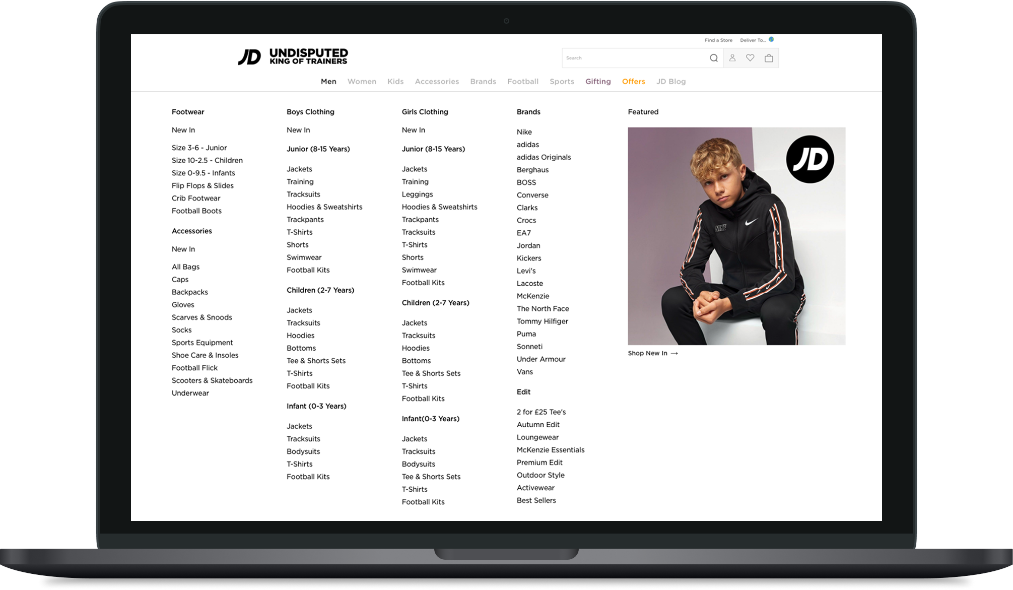
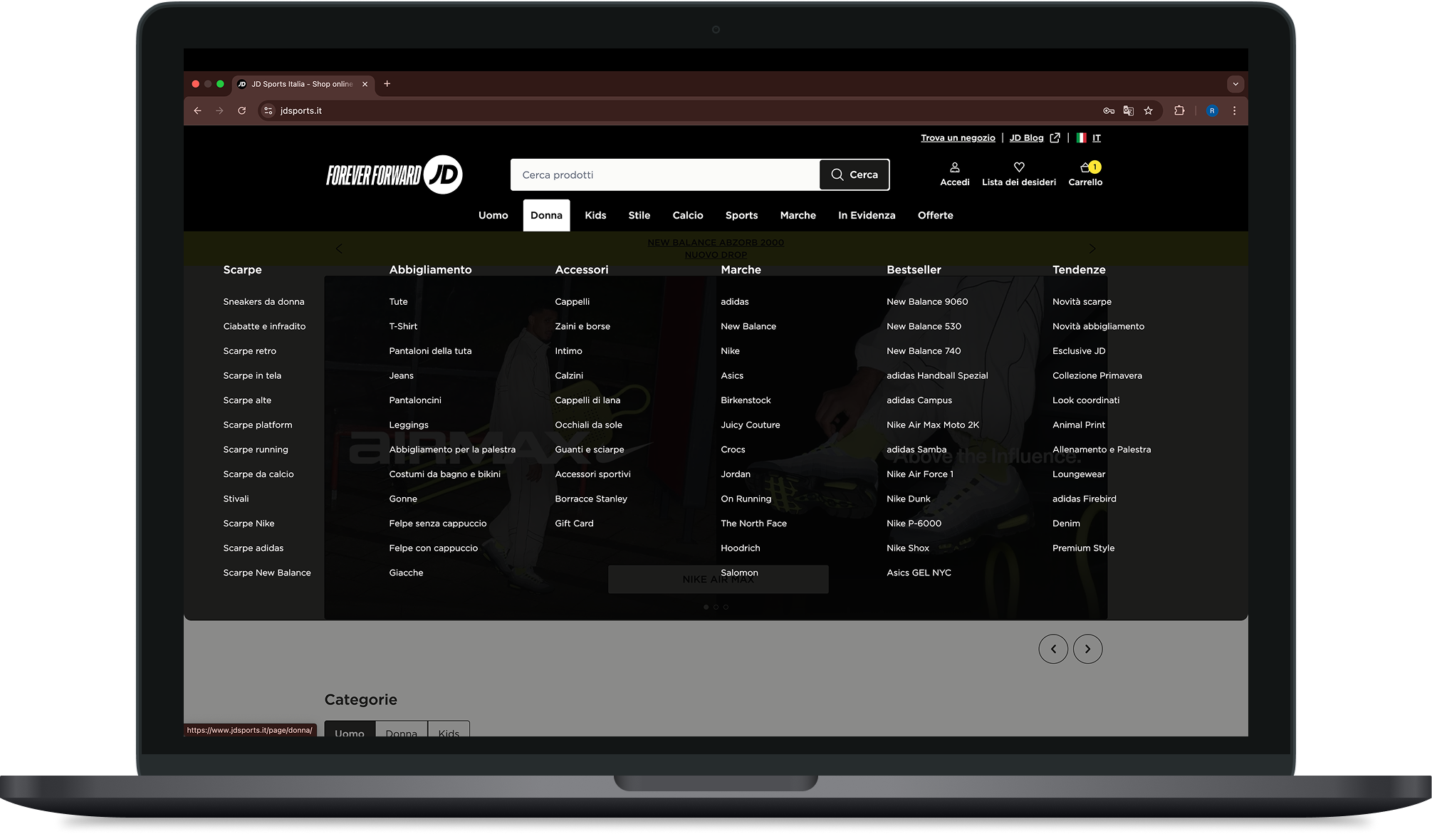
JD’s main navigation had grown organically over time.
New categories, brands, campaigns and trading priorities were layered on without structural reconsideration.
The result:
Inconsistent category logic
Overloaded menus
Tension between merchandising and usability
Mobile and desktop behaving differently
The brief was optimisation.
The opportunity was architectural redesign.
Project Team
The project team consisted of a Product Manager (PM), Business Analyst (BA), and myself as the Product Designer from JD Sports, working alongside JD engineering teams.
Key stakeholders involved in the project included the Head of SEO for the UK, Head of SEO for Europe, and Trade representatives for both the UK and European markets. The work was highly collaborative, bringing together product, engineering, commercial, and SEO perspectives to align on the problem and shape the solution.
The Real Problem
Navigation wasn’t just cluttered — it reflected internal org structure, not customer mental models.
Commercial pressure meant:
High-margin categories pushed to top level
Campaign links competing with core journeys
SEO considerations influencing labelling
Merchandising priorities changing weekly
Users, meanwhile, were trying to:
Find products quickly
Browse by intent (sport, brand, gender)
Understand where they were in the hierarchy
This was a structural and governance issue — not a visual one.
Approach
1. Reframe Navigation as a System
In kickoff, I positioned navigation as:
The structural backbone of the ecommerce experience.
Not a menu redesign — a scalable taxonomy decision.
This shifted conversations from “where should we put X?”
to “what mental model are we committing to?”
2. Diagnose the Current State
I analysed:
Search query data
Top navigation click paths
Drop-off points
Category overlap
Mobile vs desktop divergence
I mapped the existing IA and identified duplication, dead ends and competing hierarchies.
This made complexity visible to stakeholders.
3. Align Around User Mental Models
I ran:
Open and closed card sorts
Tree testing on proposed structures
Internal workshops with Merchandising & Trade
The tension was predictable:
Commercial priorities vs cognitive simplicity.
Rather than remove commercial needs, I created rules:
Core taxonomy remains stable
Campaigns live in controlled promotional zones
Top-level categories reflect user entry points, not margin
This prevented future sprawl.
Strategic Decisions
1. Simplify Top-Level Categories
Reduced redundancy and clarified primary entry routes.
2. Separate Structural vs Promotional Space
Stopped campaigns from corrupting IA.
3. Align Mobile & Desktop Behaviour
Committed to a shared taxonomy with platform-appropriate interaction patterns.
4. Introduce Governance Principles
Defined criteria for adding new categories or links.
This was critical.
Without governance, navigation would degrade again.
Delivery Under Constraints
Constraints included:
SEO equity tied to existing URLs
Trade teams requiring agility
Engineering limitations within the CMS
Tight trading calendar windows
To manage this, I:
Phased rollout by category
Preserved key URLs where needed
Designed flexible mega-menu templates
Created documentation for future additions
This balanced structural improvement with operational reality.
Outcome
Navigation click through rate increased from 18% to 32%. Weekly revenue from navigation journeys rose from £125k to £205k — a 64% uplift that held post-launch.
Beyond the numbers: category duplication was reduced, findability improved in tree testing, and mobile and desktop now share a consistent taxonomy with governance rules to keep it that way.
Navigation shifted from reactive to intentional. The structure is now something the business owns — not something it inherits.