
Paddy Power - Anti-Money Laundering
Context
Customer Services raised a problem directly with the Director of Design: customers going through AML and responsible gambling verification only found out about it in one of two ways — an outright account ban, or a phone call. There was nothing in between. No warning, no explanation, no chance to act before the account was already suspended.
That was passed to me and a PM to investigate. There was no existing brief beyond the problem itself — we had to define what "a better way" actually meant before we could design anything.
Team
Sole designer on this, working with a PM, Legal, Compliance, and Engineering throughout.
Where It Started — The Workshop
Before any wireframes existed, I ran an ideation workshop with the AML team to map every touchpoint a customer could hit on the path to suspension, and to work out the escalation logic itself: what triggered a message, at what threshold, and what happened if a customer didn't respond. That session produced a live-mapped touchpoint diagram and, from it, a UML flow of the full escalation logic — the actual decision structure the messaging would need to follow, not a rough sketch of one.
The Real Disagreement — How Hard to Push
The friction wasn't over whether to build this. It was over how many messages customers should see, and how forcefully.
Compliance and Customer Services wanted to push hard: frequent, prominent, unavoidable messaging. My instinct going in was the opposite — this read to me as a messaging system, and my design instinct was to keep it subtle, low-friction, out of the customer's way as much as possible.
The workshop changed my position. Sitting with the AML team and going through what these thresholds actually represented, and what it cost the business when a customer went unwarned all the way to suspension or a phone call, I understood the stakes differently. This wasn't a notifications-design problem. It was a last real chance to keep a customer in control of their own account before the business had to take that control away. Subtlety would have optimised for a calmer interface at the cost of customers who could have acted sooner if the message had actually landed. I changed my own approach as a result, not because I was overruled, but because I'd been shown something I hadn't accounted for.
Straight to High Fidelity
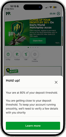
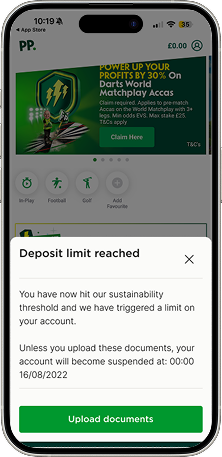
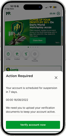
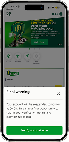
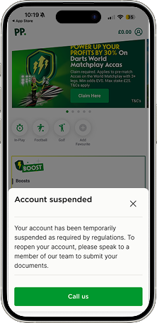
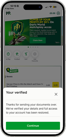
Rather than testing with mockups, I designed the actual escalation messages in full Paddy Power branding, live in-product. The stakeholders on this — Compliance, CS, AML — weren't familiar with UX process, and a polished mockup risks being read as "just a concept." Showing the real thing, in the real brand, forced a reaction to something they could evaluate as if it were already live.
The experience was built device-agnostic by design: a customer warned in-app would see the same message, at the same stage, uninterrupted, if they logged in on desktop the next day. The escalation state followed the customer, not the device.
The additional touchpoints inside My Account followed the same logic but lived within a more technically complex part of the platform, and as a result didn't evolve at the same pace as the primary escalation flow. That's an honest gap: the core journey got the full iteration; the My Account surface got a slightly less refined version of the same idea.
Outcome
Typically, customers verified after seeing the second message in the sequence, materially reducing the volume of cases that needed a Customer Services phone call to resolve.
Suspensions dropped 82% following launch.
Not every outcome was positive, and I don't think it should be presented as if it were. 13% of customers who entered the escalation flow refused to verify and were lost as customers. That's a real cost of the approach, not a rounding error, and it's the direct trade-off of pushing harder rather than staying subtle. The business judgement was that preventing suspensions and reducing manual CS intervention at that scale justified the loss. I think that's a defensible call, but it's not a cost-free one, and I'd want any hiring manager reading this to see that I know the difference.
Key Decisions I Personally Drove
Ran the workshop that mapped every AML touchpoint and the underlying escalation logic before any design work began
Changed my own initial design position after the workshop surfaced the real cost of under-warning customers, rather than holding my original instinct by default
Designed the escalation messages at full production fidelity, in real brand, so non-UX stakeholders could react to something real rather than a concept
Built the experience device-agnostic, so a customer's escalation stage persisted accurately between app and desktop
Was direct about the trade-off in the outcome — significant suspension and CS-cost reduction, against a real 13% customer loss — rather than presenting only the positive figures