
JD Sports - Future Vision App Work
- Unfunded
- No formal budget at the outset
- Self-Initiated
- Coalition of design, product and trading
- Full Spec
- Experience areas specified, navigation through checkout
- Signed Off
- SLT-approved direction — build not yet funded
Why this case study exists
Nothing else shipped for JD’s native apps belongs in a portfolio. Following the data breach, the replatform was resourced entirely as the security response, every function funded against it, with nothing left over for visual polish on iOS and Android. The app worked. It wasn’t something I’d choose to show anyone.
That’s stated plainly in the My Account case study: the app was ugly, but secure, and the trade managers pushed for investment most months and got shut down. This case study is the one exception, and it exists precisely because it sits outside that constraint. It’s not shipped work. It’s the thing three of us built specifically because nothing shipped was worth showing.
A deck wasn’t going to move the conversation
The same pattern shows up elsewhere in this portfolio at smaller scale. On My Account, a Top Brands and Gamification concept only got a hearing because I built it as a screen, not a slide, the business needs to see something to get excited, and ideas presented as a deck rarely clear that bar. Here, the stakes were bigger: a security-first mandate had shut down app investment conversations for months running, and nothing about repeating the ask in another meeting was going to change that.
So the plan changed. Instead of arguing for budget with a deck, we built the thing the budget would pay for, and built it properly enough to be judged on its own terms rather than waved through as a mood board.
A coalition, not a mandate
This was never a resourced project. There’s no project name on a roadmap, no budget line, no sign-off to start it. It was me, an app PM, and a trading manager, choosing to spend time outside our day-to-day workload building a coherent vision for what the native apps could be, on the bet that a credible, working direction would move an investment conversation that arguing for it directly hadn’t.
That’s a meaningfully different kind of story to the other six case studies here. Those are about self-initiation inside a role with real authority to ship. This is about self-initiation with none of that, no mandate, no budget, no guarantee it would go anywhere.
What we specified
The core experience areas, documented with the same rigour a funded design system would get, not as disconnected concept screens but as a coherent specification: each screen tagged by hierarchy (mandatory versus dynamic content zones), cross-referenced against a shared page index, and justified against cited research rather than opinion.
Navigation. A persistent global bar (Home, Shop, JD Status, Basket, My JD) grounded in the finding that most users enter their shopping journey through Shop rather than search, plus a multi-modal search covering text, voice, and photo.
Onboarding. Benefit cards ahead of any login prompt, a choice between a condensed one-page account creation and a step-by-step flow, magic-link authentication to cut early friction, and a Style Assistant questionnaire that turns onboarding into a personalisation signal rather than a wall a new user has to get past. Grounded in the industry finding that a significant share of users abandon an app after a single session, and that strong onboarding can meaningfully lift retention.
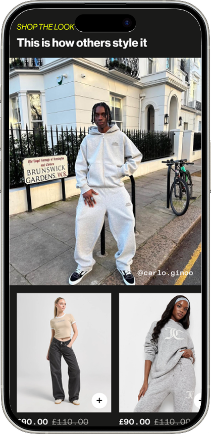
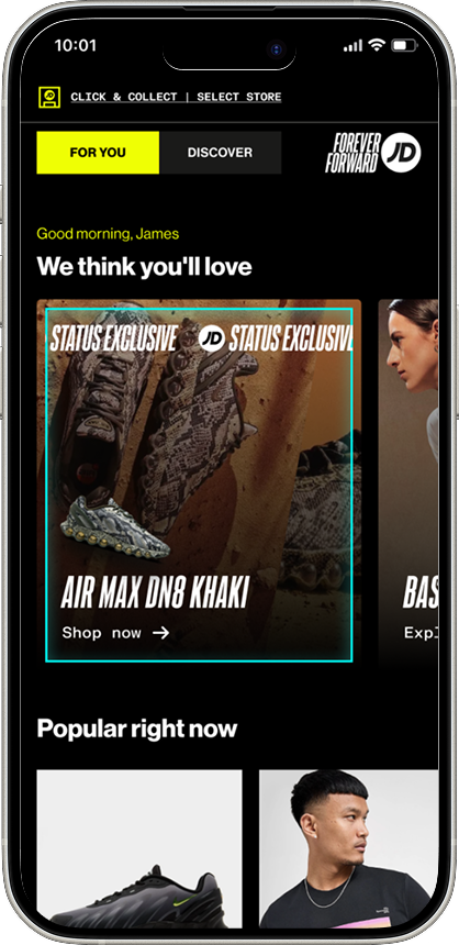
Homepage, two modes. A “For You” experience built around real personalisation, styling pulled from actual customer content, recommendations tied to past purchases, greeting copy that changes with the time of day, and a “Discover” mode built for browsers who haven’t signed in, editorial and campaign-led rather than data-driven. Two different jobs for two different visit intents, not one homepage trying to do both.
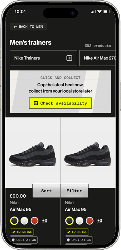
Category and product listing. Search and filtering positioned as the real entry point to the shopping journey, not an afterthought, backed by a cited finding that reordering filters by actual user interaction data measurably lifted post-filter conversion on both desktop and mobile. Product cards specified down to the swatch, with the business case attached: JD’s own data showed products displaying more colour options converted meaningfully better through to purchase, representing a significant daily uplift in incremental orders once rolled out fully.
Product detail. Structured, section-based product information rather than a wall of copy, click & collect and delivery options surfaced inline, and sizing guidance prioritised on the evidence that the sizing tab got materially more engagement than delivery and returns.
Reviews. A dedicated review page with a fit sub-score, filterable rating distribution, and a submission flow that doesn’t require login, aimed directly at the finding that shoppers without visible, credible reviews convert worse.
Checkout. A basket built to double as confirmation and editing in one place, express checkout given top billing on the evidence that users prefer it over a full form, and JD Cash loyalty spend built into the flow rather than bolted on at the end.
Every section carried the same design-principles framework, reduce the noise, make it personal, land with impact, form and function shouldn’t be opposites, so the whole specification reads as one coherent point of view rather than a set of unrelated ideas stitched together.
What actually happened
SLT reviewed the work and signed off the direction, the visual language, the interaction patterns, the product priorities, for the native apps going forward. That’s real: design direction now exists where none did before, and it has leadership agreement behind it.
What it isn’t is committed build investment. Design sign-off and engineering budget are two different decisions, and only the first one has landed so far. The investment case is still being made. I’d rather say that plainly than let “SLT signed off” imply more than it does.
Key decisions I personally drove
Identified that a slide deck wasn’t going to move a budget conversation stuck behind a security-first mandate, and proposed building a working specification instead.
Led design on a self-initiated vision alongside an app PM and a trading manager, with no formal mandate or budget, run entirely alongside full business-as-usual workload.
Set a coherent design direction and a consistent design-principles framework across the core experience areas, from navigation through checkout, rather than a set of disconnected concept screens.
Grounded the specification in cited research and real JD conversion data throughout, including the colour-swatch and filter-ordering findings, rather than presenting the vision as opinion.
Got the direction formally signed off by SLT, converting an informal push into an actual leadership decision, even though committed build investment hasn’t followed yet.
What I’d do differently
I’d pair the vision work with a lightweight cost and impact case from the start, even a rough one, so SLT’s design sign-off arrived with a clearer next decision already attached. Right now “the investment case is still being made” is an open thread with no forcing mechanism behind it. A rough business case alongside the screens might have turned design approval into a budget conversation on the same day, rather than two separate asks months apart.