
One Verification System, Two Regulated Triggers
Context
Two live, separate regulatory requirements were running at Paddy Power and Betfair in the same timeframe: anti-money laundering (AML) verification, triggered once a customer's spend crossed £30,000, and standard KYC (identity and address) verification, a standing requirement independent of spend. Different squads, different PMs, no shared roadmap between them.
The AML problem arrived first, and it arrived as a complaint, not a brief. Customer Services raised it directly with the Director of Design: customers only found out they were going through AML and responsible gambling verification in one of two ways — an outright account ban, or a phone call. Nothing in between. No warning, no explanation, no chance to act before the account was already suspended. That was passed to me and a PM to investigate, with no brief beyond the problem itself — we had to define what “a better way” meant before designing anything.
KYC ran alongside it as a separate, standing requirement, owned by a different squad. Two regulatory triggers, two teams — but I was the only designer working across both, and eventually the only person who noticed they didn't need two different ways of asking a customer for a document.
My role
Sole designer across both AML and KYC, working with a PM, Legal, Compliance, and Engineering on the AML side, and a separate PM and squad on KYC. No shared roadmap connected the two projects — the connection is something I made, not something that existed structurally.
The decision nobody asked me to make
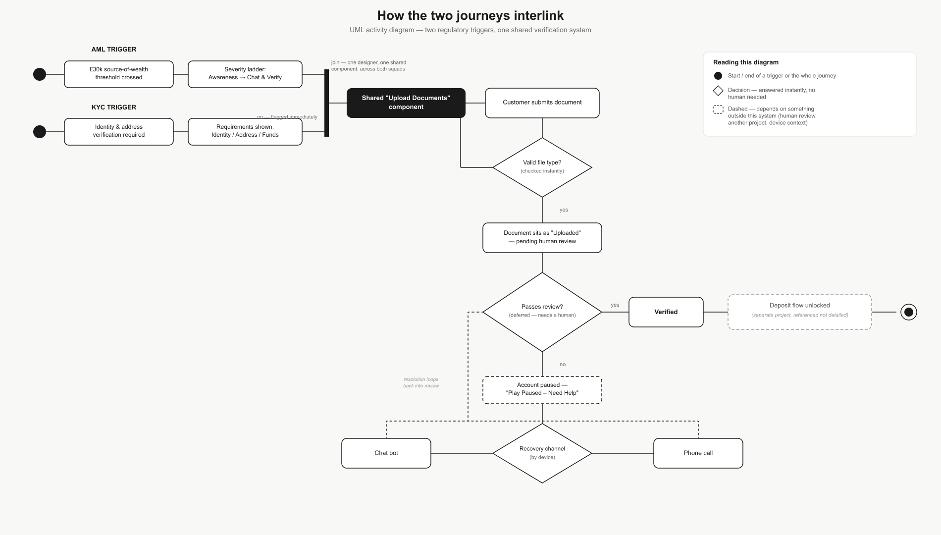
Both squads were heading toward building their own version of the same screen — one that asks a customer to upload a document, checks it, and tells them what happened next. I proposed one shared “Upload Documents” component instead of two, for two reasons. The UX case: a customer shouldn't have to learn two different ways to submit a document depending on which regulation happened to trigger the request. The engineering case: one component to build, test, and harden is cheaper than two, for both squads, indefinitely — that argument mattered as much to getting it built as the design rationale did.
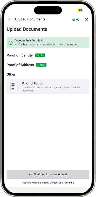
The result: one Upload Documents screen sits at the centre of both journeys. What a customer is asked to upload depends on which trigger brought them there — proof of funds for AML, identity and address for KYC — but the mechanism, requirements formatting, upload interaction, and status tracking are shared.
Off-ramp one: AML
Where it started — the workshop
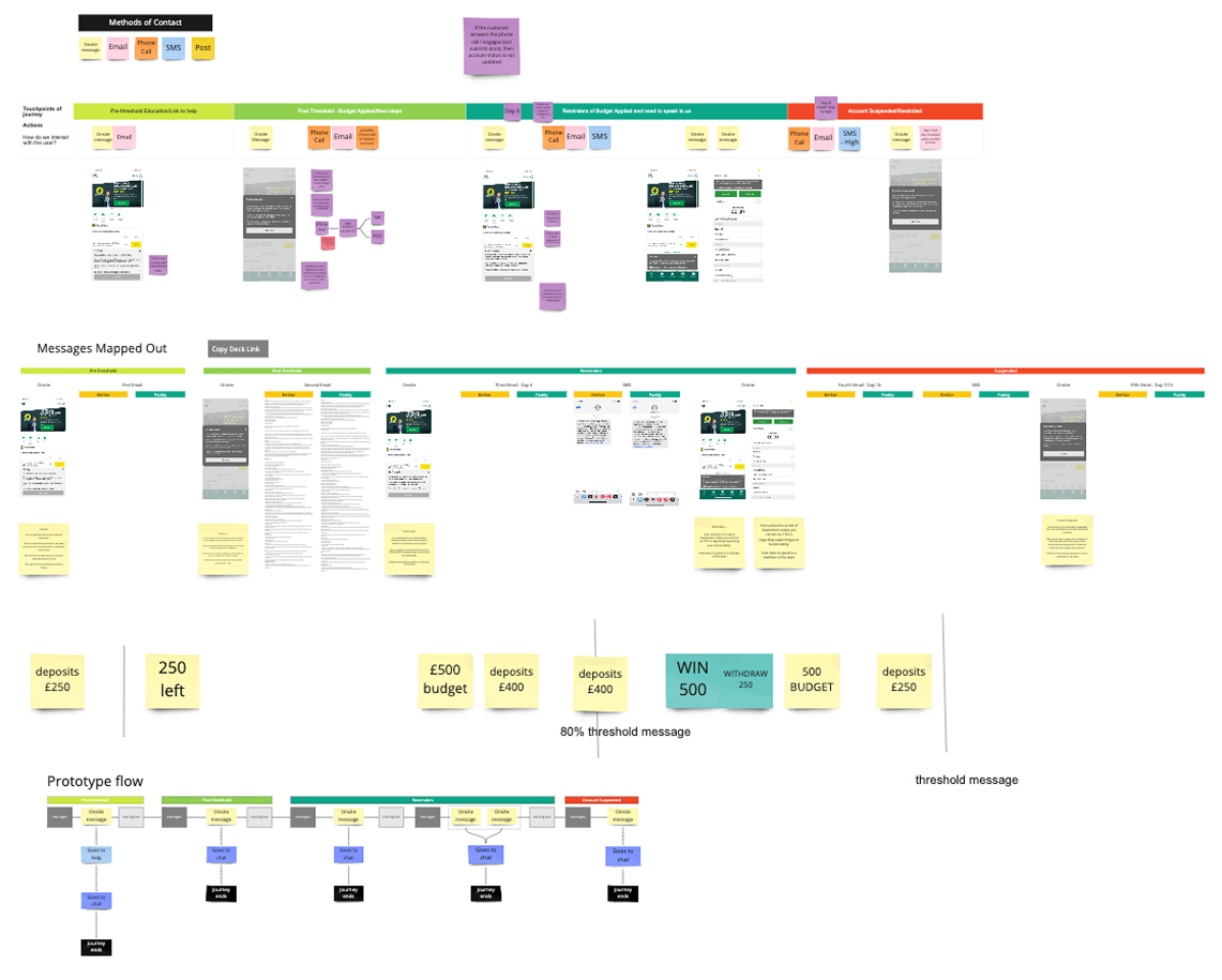
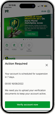
Before any wireframes existed, I ran an ideation workshop with the AML team to map every touchpoint a customer could hit on the path to suspension, and to work out the escalation logic itself: what triggered a message, at what threshold, and what happened if a customer didn't respond. That session produced a live-mapped touchpoint diagram and, from it, a UML flow of the full escalation logic — the actual decision structure the messaging would need to follow, not a rough sketch of one.
Separately, discovery work established why the existing channels were failing. Every touchpoint that existed — phone calls, emails, SMS — was outbound and post-threshold, none of it inside the product itself. Users approaching the threshold were logging into the app 7–9 times a week, but rarely opening My Account, email, or answering calls from an unfamiliar number. The channel was failing on context, not content. Whatever we sent people, sending it outside the product they were actively using was the wrong starting move.
The real disagreement — how hard to push
The friction wasn't over whether to build this. It was over how many messages customers should see, and how forcefully.
Compliance and Customer Services wanted to push hard: frequent, prominent, unavoidable messaging. My instinct going in was the opposite — this read to me as a messaging system, and my design instinct was to keep it subtle, low-friction, out of the customer's way as much as possible.
The workshop changed my position. Sitting with the AML team and going through what these thresholds actually represented, and what it cost the business when a customer went unwarned all the way to suspension or a phone call, I understood the stakes differently. This wasn't a notifications-design problem. It was a last real chance to keep a customer in control of their own account before the business had to take that control away. Subtlety would have optimised for a calmer interface at the cost of customers who could have acted sooner if the message had actually landed. I changed my own approach as a result, not because I was overruled, but because I'd been shown something I hadn't accounted for.
What I built
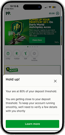
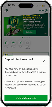
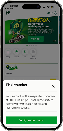
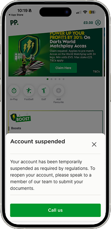
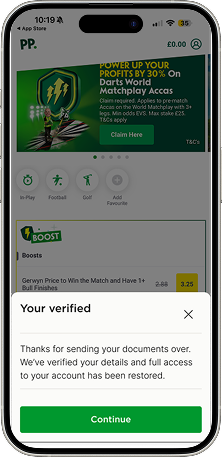
A severity ladder — Awareness, Education, Urgency, Escalation, Chat & Verify — with wording that escalates in register at every stage, running on two clocks depending on risk tier: a 7-day window for high risk, 14-day for medium. One shared copy deck, fed into by Brand, Legal, Compliance, and the AML team across both Paddy Power and Betfair, so every message could be audited and defended before it shipped.
Rather than testing with mockups, I designed the actual escalation messages in full Paddy Power branding, live in-product. The stakeholders on this — Compliance, CS, AML — weren't familiar with UX process, and a polished mockup risks being read as “just a concept.” Showing the real thing, in the real brand, forced a reaction to something they could evaluate as if it were already live.
The experience was built device-agnostic by design: a customer warned in-app would see the same message, at the same stage, uninterrupted, if they logged in on desktop the next day. The escalation state followed the customer, not the device.
The additional touchpoints inside My Account followed the same logic but lived within a more technically complex part of the platform, and as a result didn't evolve at the same pace as the primary escalation flow. That's an honest gap: the core journey got the full iteration; the My Account surface got a slightly less refined version of the same idea.
Outcome
Typically, customers verified after seeing the second message in the sequence, materially reducing the volume of cases that needed a Customer Services phone call to resolve. That showed up directly in contact volume: a 99% reduction in outbound calls to customers nearing the threshold, and a 22.5% reduction in inbound contacts related to AML threshold queries. Suspensions dropped 82% following launch.
Not every outcome was positive, and I don't think it should be presented as if it were. 13% of customers who entered the escalation flow refused to verify and were lost as customers. That's a real cost of the approach, not a rounding error, and it's the direct trade-off of pushing harder rather than staying subtle. The business judgement was that preventing suspensions and reducing manual CS intervention at that scale justified the loss. I think that's a defensible call, but it's not a cost-free one, and I'd want any hiring manager reading this to see that I know the difference.
Figures current to 2022, my last full year on the project.
Off-ramp two: KYC
The requirements aren't simple, and shouldn't look simple
Where the AML off-ramp is about timing — catching a customer before their account gets suspended — the KYC off-ramp is about proof. The document itself has to be right, or the whole chain stalls.
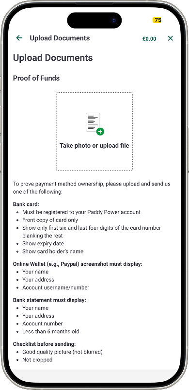
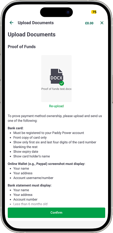
Proof of Funds, for example, has real, specific validation logic: a bank card must be front-copy only, blanking all but the first six and last four digits, showing expiry date and cardholder name. A wallet screenshot needs name, address, and account number visible. A bank statement has to be under six months old. Every document has its own checklist — good quality, not blurred, not cropped — before it's even submitted.
Where the two off-ramps meet
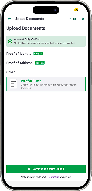
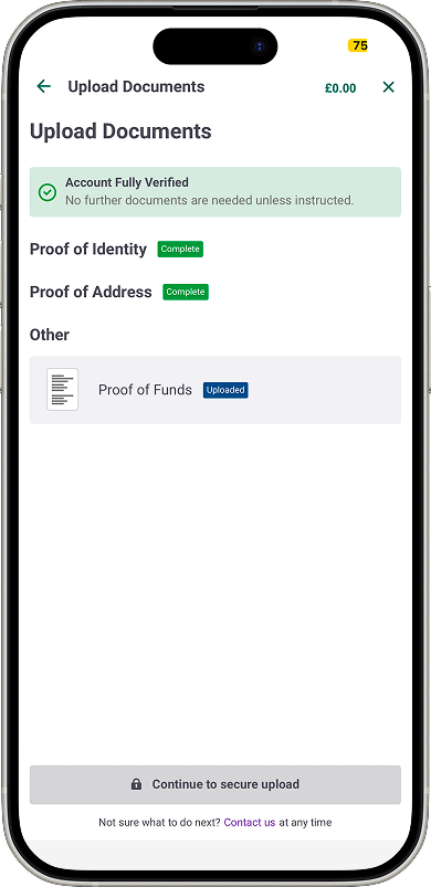
Whichever trigger brought them here, a customer lands on the same Upload Documents hub, showing every requirement they're being asked for — Proof of Identity, Proof of Address, Proof of Funds — each tracked independently with its own status. That's a materially different experience from a single linear escalation ladder: multiple regulatory requirements, sitting side by side, each progressing on its own.
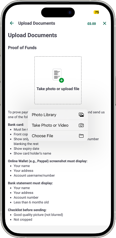
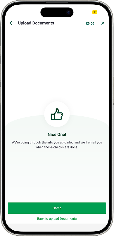
From there: read the requirements for the specific document type, use the native file picker, upload, confirm — and the document sits in a pending state until it's reviewed, with the customer told plainly that they'll be notified once checks are done.
Outcome
Time to verification dropped from 3–5 days — when checks were done manually, over email — to roughly 24 hours. First-time approval rose from around 75% to 85%.
Both figures moved at the same time a new verification partner took over the actual document checking, so they need to be held differently. The speed improvement is largely down to their system, not the interface: how fast a document gets reviewed isn't something an upload screen controls. The approval-rate increase has a more plausible connection to the design — specific, upfront requirements directly reduce the kind of failed submissions that come from a customer guessing what's needed. Still directional, not proven, since the partner's own review process changing at the same time could account for some of it too — but it's the number I'd defend if asked which one was actually mine.
Where verification leads
Verified isn't the end of the journey — it's what unlocks the deposit flow, a separate project I delivered, so a customer can actually fund their account and bet. Worth including because it closes the loop the case study otherwise leaves open, not as a full breakdown in its own right: the deposit screen carries the responsible gambling limit tracking (deposit amount against a monthly cap, remaining balance, reset date) that ties back directly to the “responsible gambling verification” framing at the start of this case study — verification isn't only about laundering risk, it's connected to spend limits the customer can see at the moment they're about to deposit. The flow also has to hand off to a third party for card authentication (Open Banking or 3D Secure, depending on the bank) and bring the customer back cleanly afterward — a different kind of edge case to the ones already covered, but the same underlying discipline: a regulated step that can't be skipped, designed so it doesn't feel like leaving the product.
The edge case: what happens when it doesn't work
This applies regardless of which off-ramp got the customer here — it's a property of the shared system, not either individual trigger.
There are two different kinds of failure, and only one can be caught instantly. A broken upload — wrong file type, a failed transfer — is flagged immediately. Whether the content of a valid file actually satisfies the requirement can't be checked in real time; that needs a human to review it. So a correctly-uploaded document sits as “Uploaded” and pending, honestly, rather than the interface pretending to give feedback it structurally can't give yet.
If a submission causes real trouble, the account can move into a paused state (“Play Paused – Need Help”) that routes into a recovery flow — and which recovery flow depends on the device. On some devices, that's a chat bot (“Account Recovery Chat”). On others, it routes to a phone call instead. Two different resolution paths for the same state, branching on context the customer doesn't choose.
What I'd do differently
I moved straight into high-fidelity screens to give stakeholders something concrete to react to — the right call for momentum, but it meant the copy deck and severity rules were formalised during delivery rather than mapped upfront, which cost time later aligning Legal and Compliance across two brand teams.
On the shared component: right now it exists because I happened to notice the overlap and had the relationship with engineering to act on it — not a standing checkpoint. The next two regulatory triggers landing on two different squads have no built-in reason to have the same conversation, unless another designer happens to be sitting across both. I'd want that check written into how new compliance requirements get scoped: does this need its own flow, or does it extend something that already exists.
Key Decisions I Personally Drove
Ran the workshop that mapped every AML touchpoint and the underlying escalation logic before any design work began.
Changed my own initial design position after the workshop surfaced the real cost of under-warning customers, rather than holding my original instinct by default.
Designed the escalation messages at full production fidelity, in real brand, so non-UX stakeholders could react to something real rather than a concept.
Built the AML experience device-agnostic, so a customer's escalation stage persisted accurately between app and desktop.
Was direct about the trade-off in the outcome — significant suspension and CS-cost reduction, against a real 13% customer loss — rather than presenting only the positive figures.
Identified that two separate regulatory triggers, owned by two separate squads, were converging on the same underlying need, and proposed one shared verification component instead of two — on both UX and engineering-cost grounds.
Wrote specific, granular document requirements upfront for the shared component, rather than leaving customers to guess what a valid submission looked like.