
How I built Arch using Claude
Arch is a touch-first reflex game built for this site, not shipped from a template. I directed every design and engineering decision across twenty-six rounds of build and critique, working with Claude as the execution partner throughout.
Context
A demo, not a deliverable
The brief was self-generated: build a mobile game that felt native, using Claude to write and iterate the code while I directed every design decision. No client, no deadline. The constraint was quality, not scope.
It had a real audience too. I had 5 nieces and nephews, aged six to thirteen, coming round over the summer, and I knew they'd get bored fast. Arch was something quick I could knock up for them to actually play, not just a portfolio piece. That's part of why it needed to feel native and work with touch rather than a mouse, it had to hold up for a group of kids who don't care how a game was built, only whether it's fun.
Prompt:
“I want to build out a game that I can share on my website. Ideally I want to log each step and prompt so that I can walk anyone interested in replicating the steps through it. I want it to feel like a native app so it needs to be a game that can be played using hands rather than a mouse.”
The Problem
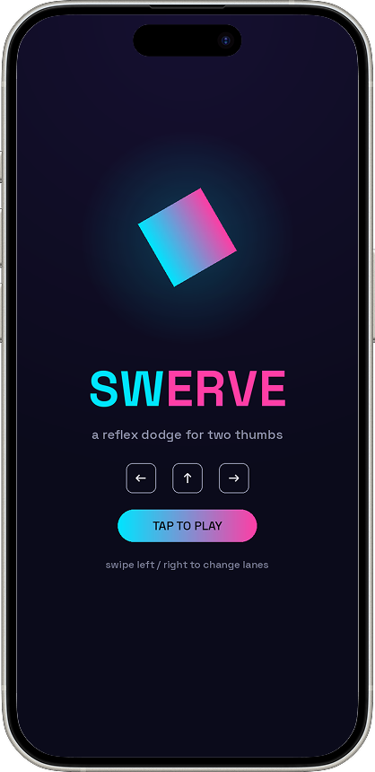
The default AI look: near-black background, one neon accent, generic everything
The first version used exactly that palette. It played fine. It looked like every other AI-built demo — which was the actual problem, not the mechanics.
Research
Naming the defaults, then deliberately avoiding them
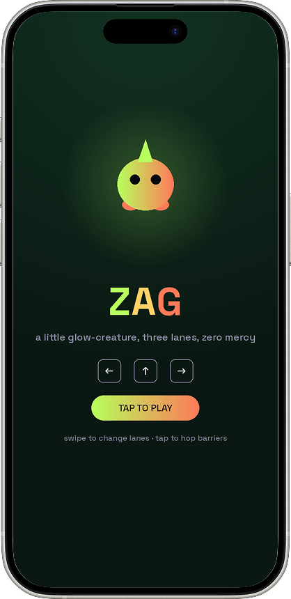
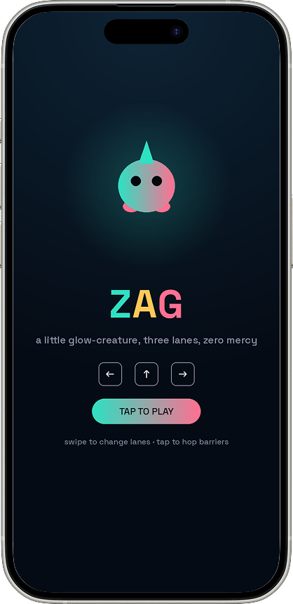
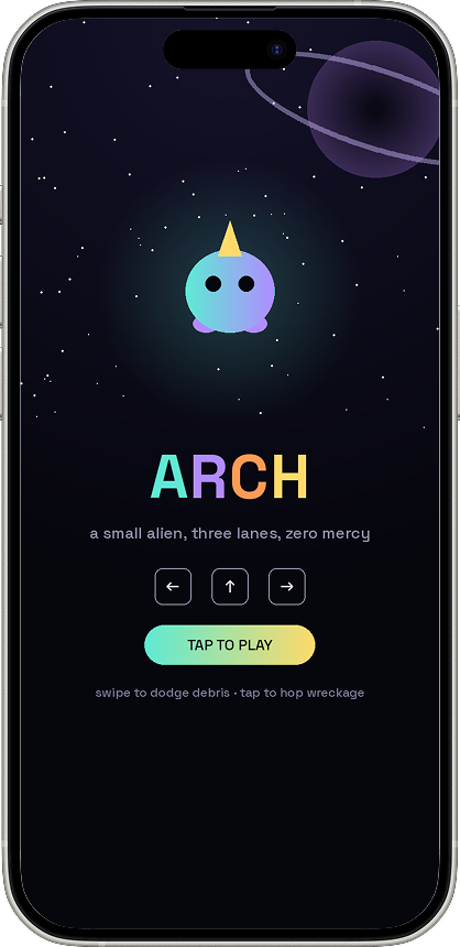
Three looks dominate AI-generated design right now: cream-and-terracotta, near-black-with-one-neon-accent, and broadsheet-with-hairlines. The first palette fell straight into the second category. Recognising the pattern was the point where the direction actually changed — first to an ocean-glow palette, then, once the character read as alien rather than generic, to a proper space setting: real stars, two dim planets, hazards modelled on actual orbital debris rather than plain rocks.
Prompt:
“I think we should think this through. Zag is almost space man/alien like. I think the background needs to feel like space with subtle stars and planets. Then the colour scheme needs to fit into that."
The identity had to come from the subject, not from the defaults.
Competing Constraints
Brand system versus game identity — held in tension, not resolved by picking one
The brand system this site runs on is explicit: light mode only, monochrome, no warm accents. Arch's whole premise is a glowing alien on a dark canvas — a direct conflict, not a minor styling disagreement. Rather than force one to win, the split follows a simple rule: page chrome — typography, the frame, the buttons — is fully brand-compliant. The interactive canvas keeps its own identity, because that's the actual product on display, not marketing copy about it.
Prompt:
“The game name ZAG is still cut off. I've also attached my brand guidelines so you can see the right colour codes to use."
Design Decision
Every hazard reskinned as real space debris — not for decoration
Lane obstacles became dead satellite fragments; the full-width hazard became derelict rocket wreckage with hazard stripes and warning lights. The colour split between them — rust-metal fragments against gunmetal-and-warning-stripe wreckage — maps onto a distinction that already existed in the mechanic: dodge by moving, or dodge by jumping. The visual choice reinforces the mechanic instead of just decorating it.
Prompt:
“Let’s look at the elements he is evading. Can they be old satellites, rockets and space debris looking? Then this can also become an ethical game about what we are doing to space."
What I Decided Not To Build
An online leaderboard — built, then removed
A working leaderboard shipped in one round, using a free public API with no backend of my own. It also meant a write key sitting exposed in client-side source, with no server-side validation of submitted scores. Fine for a five-minute proof of concept. Not something to leave live on a professional site. It was removed entirely rather than left half-secured — the honest version of this feature needs an actual backend, which is a deliberate later phase, not a compromise made now.
Prompt:
“Remove the leaderboard. When we build that I want it done properly and securely but for MVP it's not needed.
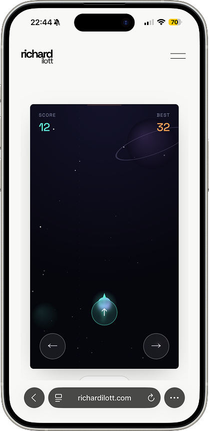
Major design flaw:
Jump button hidden behind the character
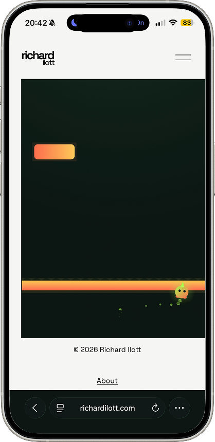
Major design flaw:
Game wasn’t responsive to fit on the screen
Accessibility
One toggle, not a checkbox
Accessible mode checks prefers-reduced-motion and prefers-contrast automatically on load, so it can already be on before anyone finds the toggle. High-contrast mode uses solid colour and black outlines on every hazard shape, so the game reads correctly without relying on colour perception at all, not just at higher contrast. It touched every visual decision made after it was introduced — palette, button layout, the logo — rather than sitting as a separate mode bolted onto a finished game.
Prompt:
“Now let's look at how we can make this more accessible. Can we have a way to toggle on an accessible version with less motion and better colour contrast."
Catching A Real Failure
A change that passed every check I'd been running, and still broke the game completely
A scaling update referenced a variable before its own declaration had run — a JavaScript timing bug, not a typo. Every validation up to that point had confirmed the script parsed as valid syntax. None of them had confirmed it actually executed. The fix was straightforward once found. Finding it meant running the script against a stubbed browser environment to prove it reached the game loop, not just that it compiled — a stricter bar than the one being used before.
Prompt:
“The game doesn't play on mobile now?"
Decisions Worth Naming
Six moments from twenty-six rounds, called out individually
Every decision in this build was mine — that’s the whole premise of directing rather than executing. These six are the ones specific enough to be worth naming on their own, not the exception to the rest.
01 Rejected the first palette on sight, even though it worked, because it matched a recognisable AI-generated default rather than the actual subject.
02 Drew the line between brand-compliant chrome and the game's own identity, rather than letting either rule bleed into the other by default.
03 Removed a fully working leaderboard feature after judging the security trade-off unacceptable for a live site, rather than shipping it with a caveat.
04 Cut a sourced, factually accurate statistic from the start screen because it worked against the game’s tone, even though it was the more "meaningful" version of the copy.
05 Caught a script-breaking regression that had passed every prior check, by insisting on an execution test rather than a syntax check.
06 Got the level-up celebration wrong on the first attempt — a two-second pause and cleared lanes, meant to feel rewarding, actually made the whole game feel stop-start. Cut the pause entirely on the next pass rather than trimming it, once real feedback showed the problem was the interruption itself, not its length.
Outcome
Twenty-six rounds in, still standing
Real usage numbers don’t exist yet — whether people actually play this from a footer link is the next data point, not this one, and that’s worth saying plainly rather than dressing up. What’s already true: it survived twenty-six rounds of real critique, a full identity rebuild, and a caught production bug, without losing what made it worth building in the first place.